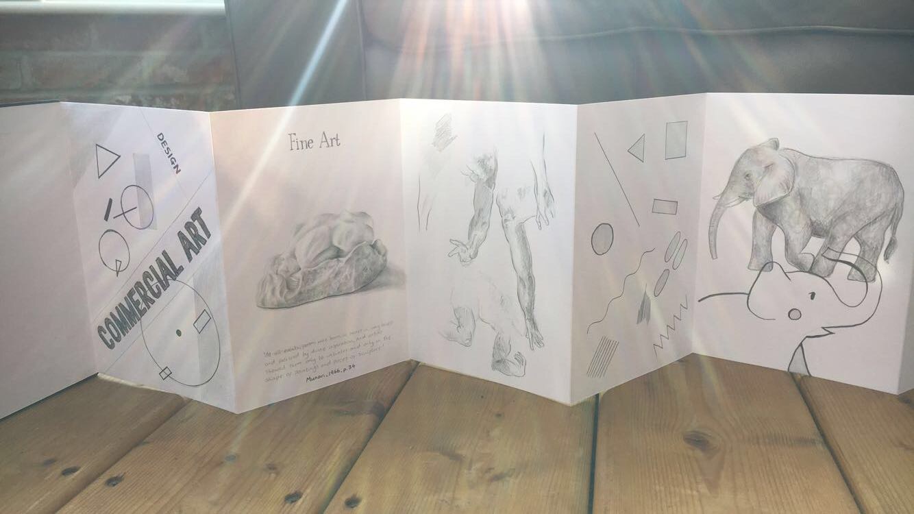
To start off my visual journal I made a conventionally
relevant piece of design and fine art to compare the use of tone, typography,
shape and line. I then simplified this with the next two pages and experimented
with how the two line styles differ, fine art would be more tonal and sketchy
compared to design which is geometric and perfectly straight. I put these two
different styles on to a page to see how they could possibly work together. I
think they actually work really well as a piece and I plan to explore this
technique more as it both relates to my quote and research and implies that the
lines between design and fine art are blurred.
No comments:
Post a Comment